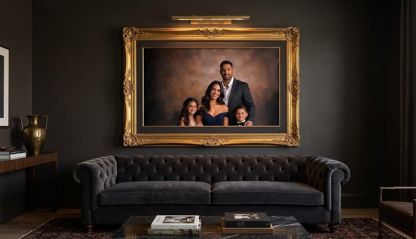
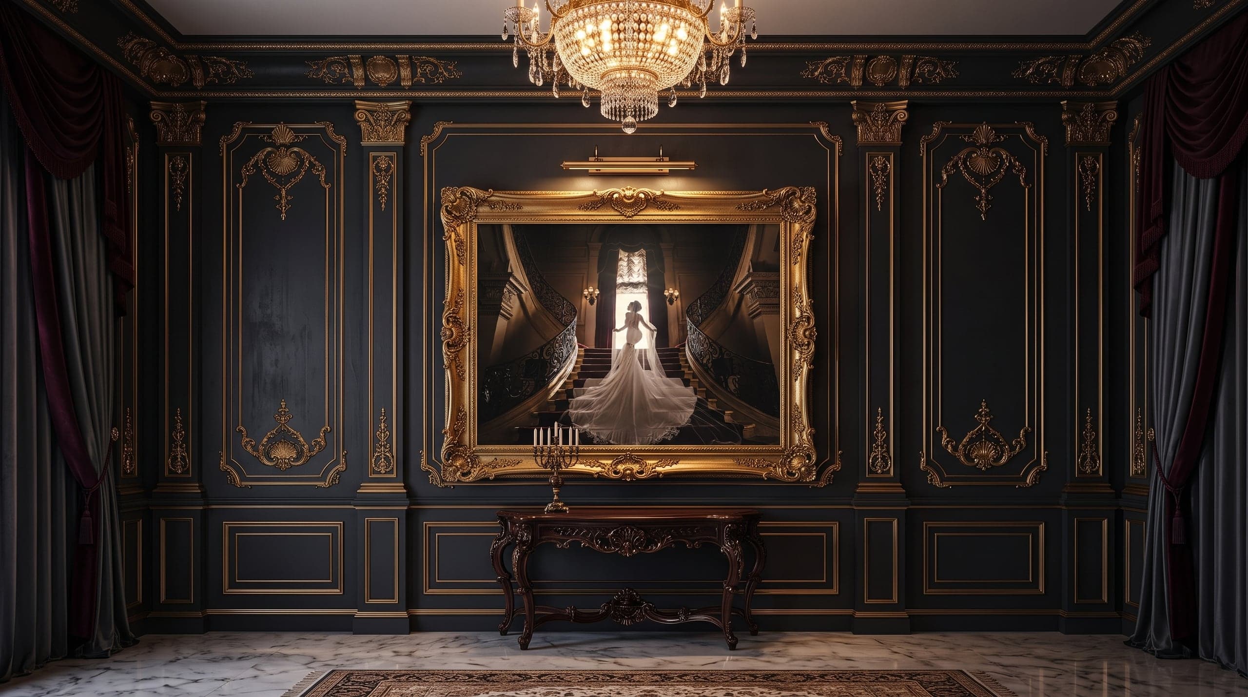
The Gallery Wall Playbook: Designing a Wall of Family Portraits
A wall of family portraits is one design object made of several pieces. Here is how we plan the layout, size the pieces, and keep a set coherent as your family grows.
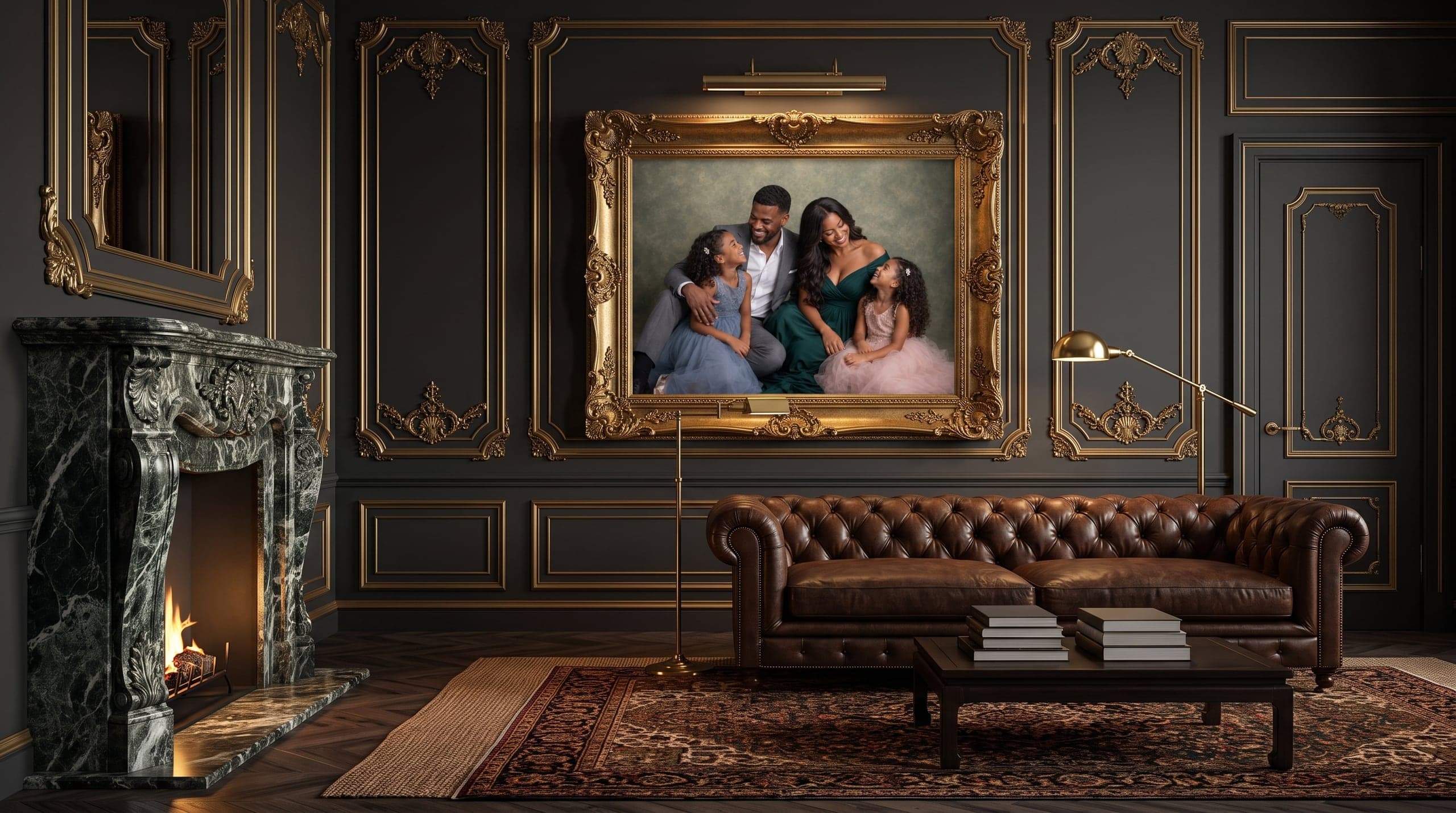
Most gallery walls happen by accident. A school picture in a black frame, a canvas from a beach trip, a print from a session four years ago that never made it out of the folder. Each piece was a fine decision on its own. Together they read as a pile rather than a plan, and everyone who walks past feels it without being able to say why.
A gallery wall is not a collection of pictures. It is a single design object built from several pieces, and it behaves like any other piece of design in a room: proportion first, content second. When we sit down with a family at the reveal, the conversation is not really about which images they love. It is about one wall, its measurements, its light, and what belongs on it for the next decade.
Start With the Wall, Not the Images
Before anyone picks a favorite frame, we want the wall. Its width and height in inches, the furniture below it, the ceiling height, and where the light comes from during the hours the family is actually home. Those four facts decide more about the finished result than any image choice.
The most common candidates in the homes we design for are the stair wall, the two-story entry, the space above a sofa, and the long hallway between bedrooms. Each has its own rule. A stair wall wants pieces that climb on a consistent diagonal, spaced off the handrail line rather than the ceiling. An entry with double height wants scale, because a modest print floating in that much air looks lost. Above a sofa, the arrangement should span roughly two thirds to three quarters of the sofa width and hang so the center of the group sits about 57 to 60 inches off the floor, which is standard gallery eye level.
We photograph the wall or ask you to, tape measure included in the frame. That single photo is what lets us design against reality instead of imagination.
The Layouts That Actually Work
There are only a handful of arrangements that hold up over years of living with them. Everything else is a variation.
Whichever you choose, commit to it. The failure mode is a grid that slowly turns into a salon wall as pieces get added without a plan.
Five reliable gallery wall layouts
- The single statement piece. One large framed portrait, centered, sized generously. The hardest to get wrong and often the most powerful
- The symmetrical grid. Three, four, six, or nine identical sizes in identical frames with identical spacing, usually two to three inches. Formal, calm, and forgiving
- The anchored cluster. One large piece slightly off center with smaller pieces orbiting it, all sharing frame and mat treatment so the variety reads as intentional
- The linear run. A single horizontal row at consistent height, ideal for hallways and for one portrait per family member
- The stair climb. Matched frames stepping along the rise, centers spaced evenly and parallel to the stair angle rather than the floor
Sizing: Almost Everyone Goes Too Small
If we had to name the single most common mistake in home portrait display, it is scale. A 16x20 print looks enormous leaning against the wall in a studio and disappears entirely on a twelve foot wall in a great room. Print size has to be judged against the wall, never against the tabletop where you first saw it.
Our working guidance: a statement piece over a standard sofa usually starts around 30x40 inches framed. A two-story entry wall often wants 40x60 or larger. A grid of nine pieces can use smaller individual prints because the group is the object, and the group should still occupy the same generous footprint a single large piece would.
There is also a viewing distance argument. A portrait seen from twelve feet away needs bigger faces than one seen from three feet in a hallway. We size faces, not paper. That is why we do this sizing work with your actual wall photograph on screen at the reveal, at true scale, rather than asking you to guess from a price list. We wrote about the broader case for getting images off screens and onto walls in why printed wall art matters, and scale is where that argument either lands or falls apart.
Frames, Finishes, and Keeping the Set Coherent
Coherence comes from repetition. Pick one frame profile and one finish for the entire wall and let the images carry the variety. A warm walnut, a matte black, a champagne gold, or a clean white are all correct answers. Mixing three of them on one wall is not, unless you are deliberately building a salon wall and are prepared to unify with mat color instead.
The same discipline applies to the images. A wall reads best when the pieces share a treatment: all color or all black and white, all made in similar light, all with related backgrounds. This is one reason we favor studio work for family sets. Controlled light in McKinney or Valencia means a portrait made this spring and one made three years from now can sit side by side without a visible seam. Sessions shot in different parks in different seasons rarely do.
Surface matters too. Glass with museum-grade anti-reflective coating is worth it on any wall that faces a window, and that describes most of the bright, west-facing living rooms we work in. Canvas and metal have their place, but for faces we usually recommend a fine art print behind glass because the detail holds. You can see the material options on our wall art page.
Designing the Wall at the Reveal
This is the part of our process that most studios skip. We do not send a gallery link and wish you luck. Every portrait session includes an in-person reveal where we project your images at real size, bring in the photo of your wall, and lay out the actual arrangement on screen with your frames and your dimensions. Decisions get made once, in one sitting, with the whole family in the room.
It sounds like a sales step. In practice it is a design step, and it is the reason our clients end up with a wall instead of a folder. Wardrobe planning feeds directly into it, which is why we talk color and coordination well before the session, the way we lay out in what to wear for family portraits. Clothing that harmonizes across a family is what lets nine frames hang together as one piece.
You can see finished examples of these installations on our artwork page, and portrait session fees and artwork collections are published on our investment page, with twelve-month interest-free financing available so a properly scaled wall does not have to be a one-payment decision.
A gallery wall is not the images you love most. It is the images that belong together, sized for the room they live in.
Build It to Grow
Families change. The best walls are designed with that in mind from the first hanging. A symmetrical grid of six can become nine. A linear hallway run can extend. An anchored cluster can absorb a new senior portrait or a maternity piece without a redesign, as long as the frame profile is one we can reorder.
So we record the specifications: frame, finish, mat width, print size, spacing. When you come back for a family session in three years, or for a senior year, the new pieces slot in rather than starting an argument with the existing ones.
That is the whole playbook. Measure the wall, choose one layout, size it larger than instinct suggests, repeat one frame, and keep a record so the set can grow. If you want to see how the session, reveal, and design steps fit together, walk through our portrait experience, or tell us about your wall and we will start with the measurements.